This is a guest blog for ERP Today written by Lori Witzel in her role as director of research for analytics and data management at TIBCO.
Data is creating ‘stories’ today inside organizations that use information flows to denote, describe and delineate the shape of their digital stacks.
Explaining that literary storytelling methods won’t translate to tell the right data stories for the new information age, Witzel writes as follows…
A picture is worth a thousand words, so says the popular maxim, and when it comes to exploring data, images and visualisation live up to the value of the phrase. Storytelling is now understood to be an important part of the business world; however, when it comes to analysing data, traditional storytelling methods are the wrong syntax. To get real value from data, organisations need to use the power of visual data storytelling.
To date, a popular approach to data storytelling is to use literary and screenwriting-based methods. These methods tell a story whereby the narrator and/or author describes to the audience how something occurred. Literary storytelling features arcs, which rise and fall, with a beginning, a middle and an end.
If data and business technology leaders rely on literary storytelling methods for data storytelling, the definitive ending has already been set. There is little room for immersive exploration, co-creation and for potentially better endings to the story being told.
Why? Literary storytelling isn’t open-ended. Even fan fiction, in which readers of the original source story create their own variations, have beginnings, middles, and ends. A better model might be that of the graphic novel. Graphic novels provide a more immersive experience, and its immersive visual analysis that fosters exploration. Using “what if” immersive visualisations allow for iteration and co-creation in ways that literary storytelling models cannot.
Draw it out
Data storytelling has captured the imagination of business and technology leaders over the last seven years. With data storytelling, the dashboard and reporting experience can be transformed from a static experience to one that’s immersive, using visualisations the audience can drill into, layer after layer. And this immersive experience is inherently collaborative, driving discussion with each iteration.
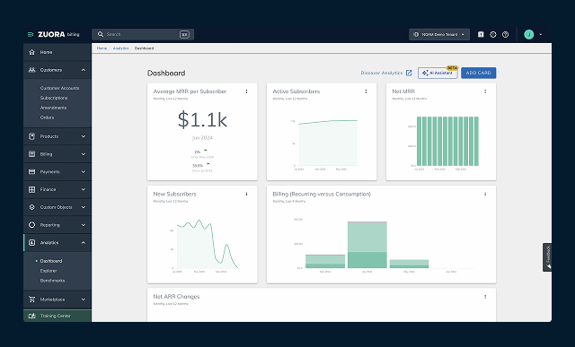
Today’s data analytics platforms provide data and business technology leaders with the ability to develop immersive, graphic novel-style data visualisations. Dashboards can be created which bring key elements of the data story to the fore. The use of visual contrast, such as image size and colour, as well as zoom-in technology, which enables members of the organisation to choose which details of the visualisation and data they want to immerse themselves within – this will elicit those varied responses and insights the organisation needs.
Let the visuals drive the story by keeping the word count limited and focused. Words should simply clarify what the audience sees. Consider how short the sentences in a speech bubble are within a graphic novel or comic, but how when combined with the imagery, the story unfolds and develops.
The best data analytics platforms provide immersive capabilities that can take the audience, whether executive board members or the wider workforce, deeper into the data and, therefore, the story. In addition, predictive analytics tools allow the organisation to explore and test ‘what if’ scenarios – a virtual sandbox, if you will, of how decisions will impact the market and the business. Data storytelling based on open-ended visual storytelling models can be used to foster debate and safely chart the best course of action for the organisation. Storytelling has always been used as a safe place to explore the possibility.
Storytelling takes off
These methods are not just stories themselves; they are used on a daily basis by Aeroporti di Roma, the international airport operator for the Italian capital. Aeroporti di Roma employs 3,500 people, serves approximately 100 airlines and, before the pandemic, received 50 million passengers, but in 2013 the airport was ranked 3.31 out of 5 by the Airports Council International, the global association of civil airport operators. This ranking placed Aeroporti di Roma below the customer experience competing airports were offering.
To turn the airport around, the organisation turned to visual data storytelling. Today Aeroporti di Roma is one of the highest-ranked airports in Europe.
By visualising passenger flows and by correlating passenger flows with other data in real-time dashboards, Aeroporti di Roma radically improved customer experience. Aeroporti di Roma created the Airport Operations Plan, a central data platform built on TIBCO technology; this integrated all backend systems across the airport to provide real-time data and a visual analytics dashboard.
Data is collected from airport devices as well as anonymised passenger mobile phone data, which allows the airport to analyse the flow of people and to understand the behaviour of travellers. The real-time data enables the airport to more effectively schedule flights, departure gates, airport staff, baggage handling, car parking, and security, especially in response to events such as weather-caused disruption.
Data storytelling and the Airport Operations Plan have created a digital twin of Aeroporti di Roma, with performance forecasting taking place throughout the day to keep operations effective and everyone in the organisation involved in the story.
Without immersive, visual data storytelling, Aeroporti di Roma would not have understood or seen the challenges. Organisations looking to begin a new data-oriented chapter need to ensure they use the right storytelling narrative for their data.


